

Modular Blocks — Build Pages Like Lego
The Modular Blocks system allows you to build the homepage and dynamic pages by composing ready-made, reusable content blocks — all from within Strapi CMS. No coding required.
1. How the Modular Blocks System Works
In Strapi, the Homepage uses a Dynamic Zone field called sections. You can add, remove, and reorder different block types in this zone. Each block you add appears as a new section on your storefront automatically.
- Go to Content Manager → Homepage in Strapi.
- Scroll to the Sections dynamic zone at the bottom.
- Click Add a component to add a new block.
- Choose a block type from the list and fill in its content.
- Click Save and then Publish to apply changes to the live site.
2. Adding New Styles & Automatic CI/CD Deployment
Adding New Styles via Strapi Dashboard
To add or remove visual styles for any block, open the Storefront Management menu in Strapi Admin, select the component and style, and click Update Storefront. GitHub Actions will build and deploy the changes (typically takes 1-2 minutes). Once the build completes, simply enter the style identifier into the section's Style text field to activate it.
- 1. Open Strapi Admin > Storefront Management
- 2. Select Component > Preview in Styles Inspector & Click + Add to Storefront (Queue)
- 3. Click Update Storefront (Automatically syncs settings preset and triggers GitHub Actions build & deploy)
3. Homepage Blocks Catalog & Visual Previews
Each block has multiple ready-made styles that you can switch in seconds by entering the style name (e.g. style-1 or style-2) into the Style text field in Strapi.
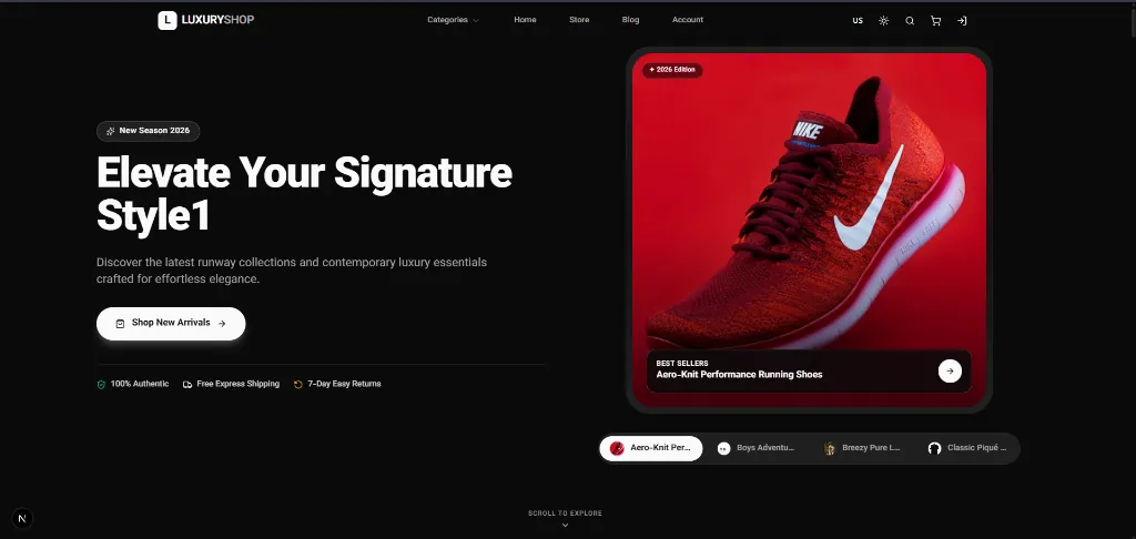
🎨 Hero Section
The primary top-of-page banner section featuring bold headlines, call-to-action buttons, badges, and focal imagery.
- Main Images: Primary product or banner images.
- Side Images: Marginal or mosaic images showcasing models and details.
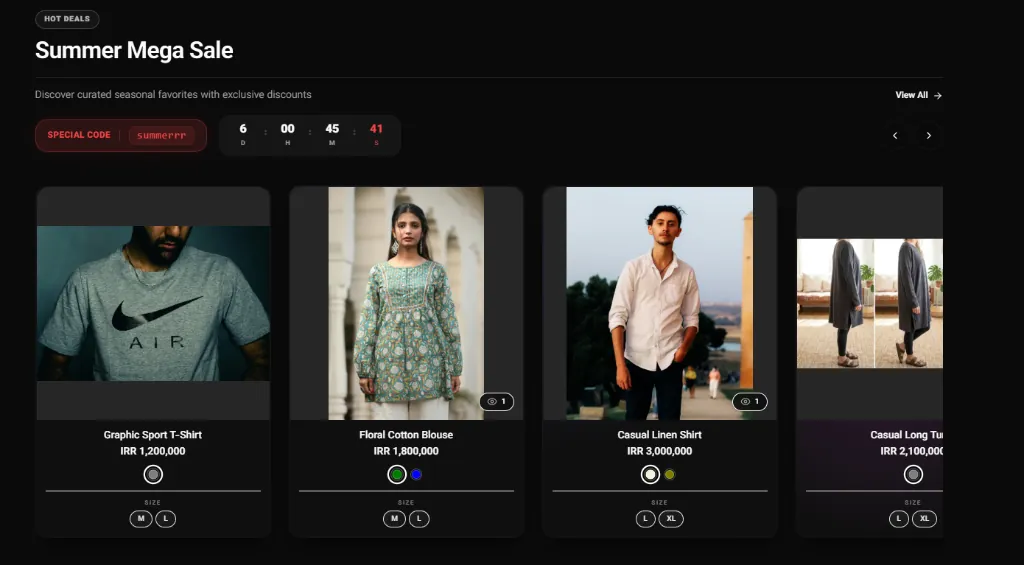
🎨 Product Showcase Section
To display products as a slider or grid along with images and preview videos.
- Products: Select products or showcase collections.
- Media (Image / Video): Ability to add a photo, GIF, or video (MP4) as a banner or dynamic style preview.
Dynamic Product Cards
Main section style (style)
🎨 Product Scroll Section
Display products as a vertical scroll next to a fixed image/banner (Split View).
- Products: Manually select the products to be scrolled in this section.
- Image: Main and fixed image on one side of the page.
Main section style (style)
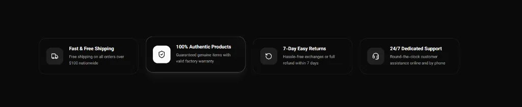
🎨 Features & Testimonials Section
To display key store benefits (free shipping, 24/7 support, etc.) as well as customer reviews and satisfaction (Testimonials / Social Proof).
- Select Content Type (contentType): Ability to choose between
features(benefits) ortestimonials(customer quotes). - Style Variety: Styles 1 and 2 for feature cards, and styles 3 and 4 for interactive and animated customer review displays.
- Includes Repeatable fields for adding infinite items, icons, photos, names, and reviewer titles.
Main section style (style)
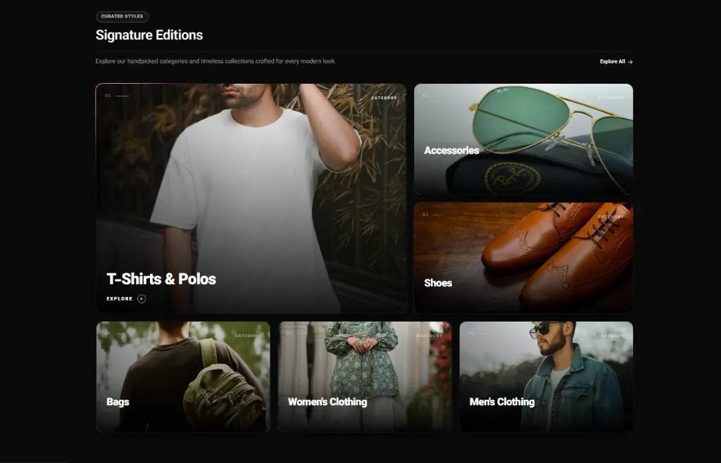
🎨 Category Collection Section
Visual display of the main site categories grid.
- Contains a Dynamic Zone field named
itemsto arrange category items together.
Main section style (style)
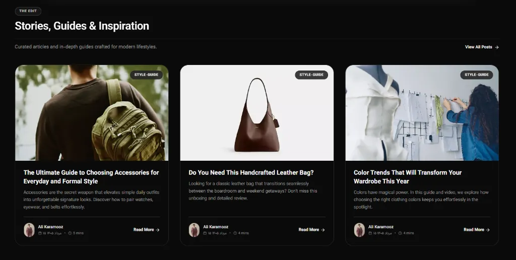
🎨 Blog Posts Section
Automatic or manual fetching of latest articles on the homepage.
- Source: Fetching method (latest, views, manual selection).
Main section style (style)
Configure Global Styles & Theme Palettes
To customize header, footer, cart, checkout, and theme color palettes, see the Global Settings guide.